Maddox produces and stocks the highest quality fully reconditioned and new transformers available on the market. Founded by a team of industry veterans, Maddox is focused exclusively on the transformer and transformer-related needs of industrial and commercial clients. We worked with the Maddox team to refresh their visual identity, establish a bold visual language, and design a new marketing and e-commerce website.
Maddox has hit upon a simple value in the market, and they've had the discipline to maintain that focus. Our goal with the refresh of their identity was to dial in everything rather than reinvent the wheel. We kept things simple and focused.


Their logo was originally inspired by the inside of a three-phase transformer. It had a lot going for it, and had garnered some brand recognition.
We cleaned up the mark by utilizing a square grid to establish the size and spacing. Then we introduced some new typography into the whole system that had a classic industrial feel. It's understated, functional, bold, and hits upon all of their brand characteristics.


The visual language really brings the brand to life through color, typography, photos, and illustrations.
Inspired by the industrial feel of the orange, we honed in the hues, and established a secondary palette inspired by Padmount transformers.
Trim Poster, Suisse Int'l, and Latin Modern Mono create a perfect pairing. The bold headlines carry a rugged dependability, while the swiss feel of the layouts and type reads like classic industrial manuals.


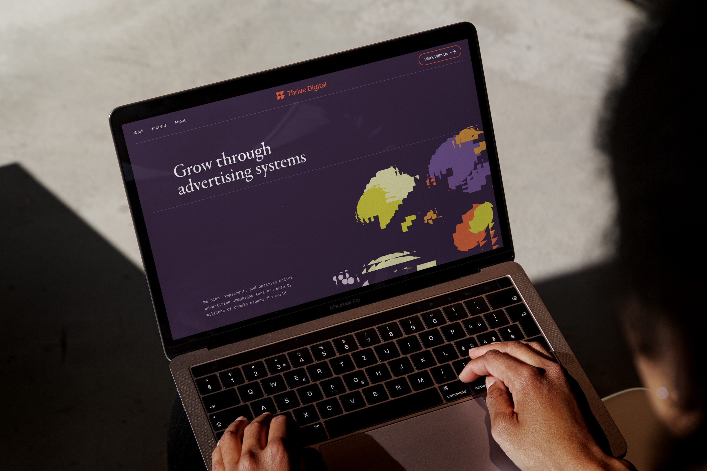
The website entailed an overhaul of their content strategy, led by Rob Sentz. Before, their marketing site and web store were separate. So we combined the two into one seamless experience and created patterns to enable consistency across the design.